How to Create a Successful Landing Page
Over the last two weeks, we’ve discussed the elements of a successful landing page and how to define your landing page goals. This week, we dive into the creation process of your landing page.
You’re ready to create your next campaign, but where do you start? How do you capture your reader’s attention so you’re sure she’ll take action? The secret is a combination of strong copy and attractive design.
Here’s how to blend those two core ingredients and create a successful landing page.
Decide on One Call To Action
That’s right, only one call-to-action!
Successful landing pages sucker punch the reader with an offer so powerful, so exciting, and so valuable, they don’t need anything else. When you set up your landing page goals, you came up with one key performance indicator (KPI) for this campaign. This KPI should be the lens you use to craft every single call-to-action on the page.
Once you have your call-to-action defined, eliminate all other extraneous bits. If your goal is to get people to sign up for your webinar, don’t have an option to sign up for your newsletter too. If your goal is to get people on your email list, don’t have an option to view all the products you sell too.
Keep your call-to-action focused exclusively on achieving your KPI. This is key.
Write Well
Landing pages are meant to hook the reader from the start and then take her through an experience that has her sitting on the edge of her seat. Your content must excite, invigorate, and capture your reader’s attention from the first second she lands on your landing page.
To do this, you need several components:
A strong headline.
Landing page headlines should reference where the person arrived from and use similar verbiage as the ad that sent the person to your page. For example, if you use a Facebook ad to get people to buy a product, reference the Facebook ad and use similar copy. This will orient your reader and make her feel like she is in the right place.
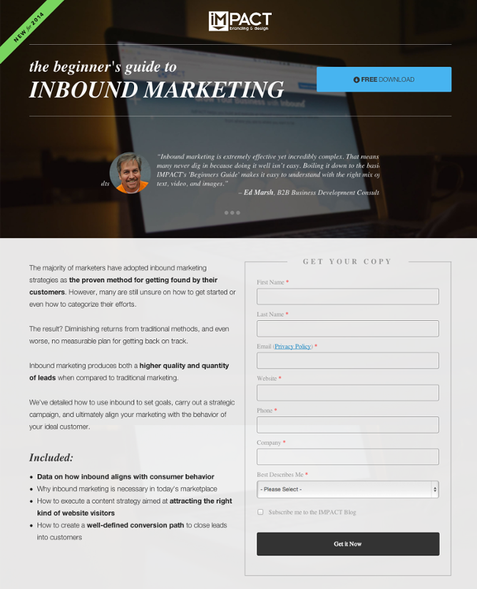
Keep it tight.
Landing pages are meant to grasp attention, not bore readers. Keep your writing short and to the point. Limit paragraphs to one to three sentences to avoid visual overwhelm.
Persuasive arguments.
People read the beginning and end of paragraphs first. Put your most persuasive arguments on the front and back end of each paragraph you write on your landing page. Then, if you need to add supplemental information, fill it in where you can.
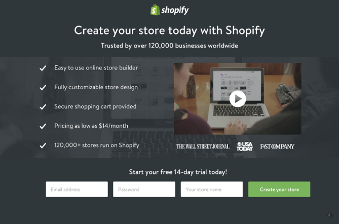
Make it Beautiful
Once the copy is solidified, make it look good. Keep the design inviting with a smooth flow. You want your reader to keep scrolling down the page, falling more in love with what you’re selling. Your design makes that possible.
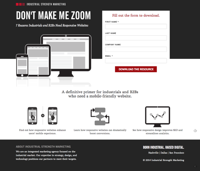
First, banish all side and navigation bars. The focus of this landing page is your one call-to-action.
In your design, pull out the call-to-action pieces and highlight them in some way. Use a brighter color or add an eye-catching graphic to get your reader’s attention.
When formatting your landing page, make it flow in a one-column format. Sending your reader’s eye across sections, tables, graphs, and other distractions will only steal from your message. Add imagery where it makes sense, but keep the design focused on keeping your reader scrolling downward.
To Summarize
For a successful blog post, you need the full package: a strong call-to-action, supporting copy that hooks your readers, and a design that pulls it all together. Without this, you’ll lose your audience and not see the type of success you’re capable of achieving.
